Feeds:
Posts
Comments

I just want to update all of my clients and readers of ColorIntervention.

My business has taken off in personal consultations!
This is great for me, but is not giving me anywhere as much time to update the blog and go through all of the emails.

So, please if you would like a consultation – be patent.
It is taking me longer than before to reply to people.

I’m still here, just getting lots and lots of in person consultations on locations and sets. If you are interested, then send me an email – and hang in there.

Thanks to everyone for the years of support!

So Close…

Many were so close to perfection here…

Great silhouette, beautiful, yet the tone was just slightly off for them to go from amazing to perfect for their own coloring and tone…

FireSoCloseNicoleKidman

Fire So Close Charlize Theron

Earth So Close Stacy Keibler

FireSoCloseJenniferLawrence

AirSoCloseKellyOsbourne

Enjoy!

Academy Awards 2013

Again wrapping up work, but will have more comments coming up…

FireBest

IceBest


EarthBest


Alas, there were no good Air’s – so I will have to search the After Parties for some good examples…


Grammy Awards

I will probably add more commentary to this later, but for now wanted to get these posted…

GrammyBestIceBestOverall


The 55th Annual GRAMMY Awards - Arrivals


GrammyBestFire

The 55th Annual GRAMMY Awards - Red Carpet

The 55th Annual GRAMMY Awards - Red Carpet


Comments for later…

So here are some examples to see what was working well from one Award Red Carpet to the other…

ColorInterventionComparisonGoodFireBadIceJessicaChastain


ColorInterventionComarisonGoodFireBadAirKaleyCuoco


ColorInterventionComarisonGoodFireBadIceClaireDanes


ColorInterventionComparisonIcetoFireMichelleDockery


ColorInterventionComparisonGoodAirBadIceKellyOsbourne


More comments later, but just wanted to get these up and posted for everyone!

So there were actually more “good” here than the Golden Globes…

But they were all in the Fire or Ice categories:

SAGBestFires

These are absolutely the best Fires from the group.  Two of these I will compare to previous bad colors in them, so you have a context for later in this post…


SAGBestIceSo many great Ice ladies here!  All are working it very well!


Comparisons will be in the post after this one!

For now enjoy all these that did great!

Okay…

I’m posting this, because there have been a lot of questions to me (and confusion) regarding these two dresses in particular…

Giving all of my readers some background information on how these award shows and the press work…

The press/media get some notes about each person/dress from either that person’s Pubic Relations Team and/or the designer themselves.  They are just reporting according to the crib notes they have on hand that have been provided from one or both of those sources.  They want things to sound “glamorous” or more exciting, so create extra adjectives to describe things that may or may not be the actual situation.

Two cases in point here:

GGBrownVersesEggplantExample1

GGBrownVersesEggplantExample2

I know, I know.  The press and media were calling these dresses “Eggplant” or “Aubergine”.  Fancy words that weren’t the actual color or tones of these dresses.  They were BROWN!  Worked for both the Fire on top and the Earth below.  I was there and saw them in person with my own Color Expertise eye.  They are BROWN dresses.  😉

Just so you know.

Just putting this post up here for now…

I will be editing and adding to this later – but this point and question comes up continually – so let’s starts showing how it works!

ColorInterventionColorLightCamera

People get confused when seeing different fabrics on TV or in magazine pictures.  The exact same fabric can look very different depending on the specific camera, lighting, or angles that are used for the specific shots.  The thing is that the person’s skin tone will also adjust accordingly – so you can’t judge a specific fabric you see on TV, Magazine, or on the Internets based on that personal view-screen level that you are seeing.  Just look at the overall balance and tones – then you’ll see if it’s working or not.

Please let me know if this opens your eyes a bit more, or if I need to answer more specific thoughts or questions regarding this.

Cheers!

Well it’s a New Year and therefore a new Award Season!

First up is the 2013 Golden Globes.

There is some memo to the stylists out there that Cool and Powdery colors are “in”; so they dressed their clients in that. Once again – not taking their skin tone  into consideration, or if it complimented them to their best.

But there were a few standouts who were in great colors and tones for themselves.
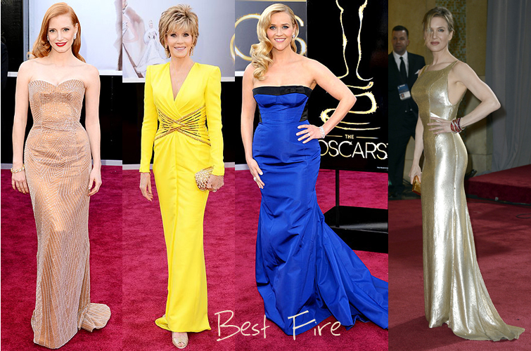
Best FIRE:

Golden Globes Best Fire 2013

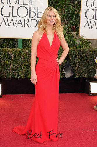
Great warm dress tone, makes her skin and hair tone all look great and blended!

Best Fire Runner Ups:

Best Fire RunnerUps

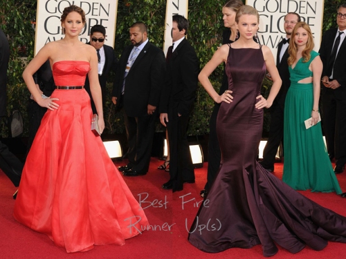
On the left – Don’t “love” the fit on the top, but overall the dress is a beautiful warm tomato color for her skin tone.  The top needs to fit her bewbs better.

On the right – This is a good example of a dark chocolate brown dress that is a good “neutral black” dress for warm Fires.  Fires should just consider this color and tone their “little black dress”.

Best ICE:

BestIceKatherineMcPhee

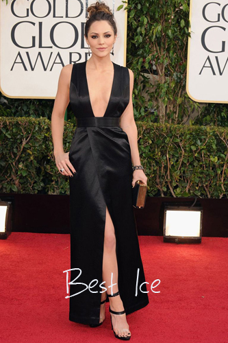
Don’t love the clear strap on the shoe, but otherwise all around great ICE dress on great Ice skin tone!

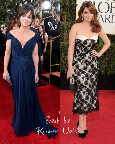
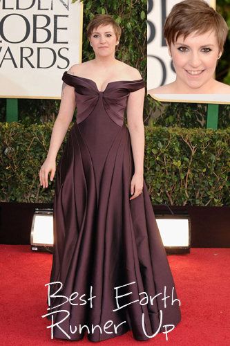
Best Ice Runner Ups:

BestIceRunnerUpsGG

On the right – Doesn’t matter what age you are – if you are wearing the proper color/tone then it will flatter you all around!

On the left – for her, it’s great!  My only nitpick is that the highlights in the hair are too warm, and should be toned to a more neutral/cool brown.  Otherwise, brava!

Best EARTH:

BestEarthJessicaAlba

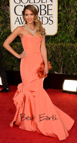
The coral/salmon color on her Earth features is perfection.  I also give her kudos for going with a warm Earth lipstick.  My only nitpick here is that I wish she would have had this necklace where the metal backing was a Rose Gold or Gold/Bronze.  Or something in Turquoise!  Either of those would have been stunning.

BestEarthLenaDunham

I know, I know…

Many of you might not “get” my choice here.  But, even though she is not a standard “Hollywood beauty”; she looked great, cute, and classy on the Red Carpet.  This deep warm brown was soooo perfect on her skin tone that I had to include a closeup picture so that you could see how much the lighting reflection made here eyes just POP their natural warm golden brown.  Up close and personal – this was stunning color and tone.

Best AIR:

BestAirKellyOsbourne

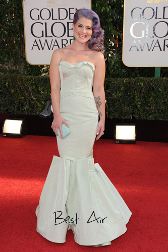
I know that not everyone out there “get’s” her hair tone.  But it is a perfect soft cool AIR tone, and therefore works on her perfectly in combination with the dress.  Her skin looks great, her eyes look radiant.  This is how bright and glowing an actual Air can look in the right Air tones.

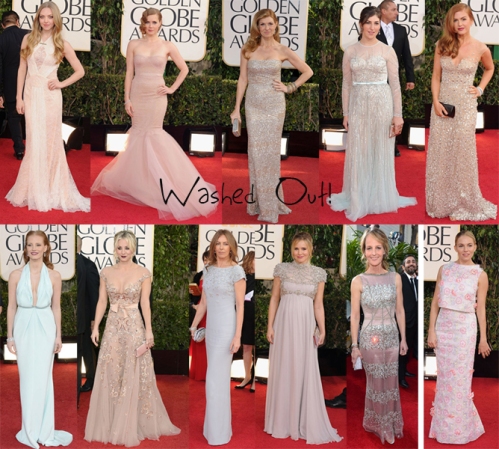
On the other hand, there were a TON of ladies wearing AIR tones that were not Airs, wearing Air tones – and it just washed them all out!  Such a wasted opportunity for all of them who should have been wearing warm FIRE or EARTH tones.  So here I present the Golden Globe 2013 Washed Out Queens:

GGBadWashedOut

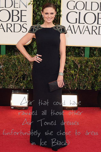
In another direction, there was a beautiful AIR lady who also would have looked stunning in any of these dresses above – but she want with an ICE black look that was “okay”, but nowhere near what she could have rocked in one of these AIR toned dresses which would have kicked her up a notch from “Okay” to “incredible”.

GGOkayEmilyDeschanelAirinIce

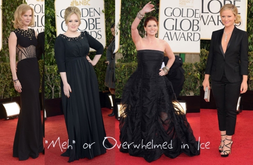
Then there were ladies who are definitely warm toned, who just overwhelmed or “meh”d themselves in Ice black:

GGBadIceOverwhelmed

More later, but wanted to get these posted ASAP for y’all!

Enjoy!

Emmy Awards 2012

Hey Everyone!

It was a super hot and humid day in Los Angeles today – so everyone was understandably melting on the Red Carpet.  That being said, I have some initial calls on who were bad in their colors and tones and who were good to great!

I will have more in the next few days, but wanted to get these up initially for my blog readers to start off the discussions.  Please remember that I am not commenting at this point on dress cut, fit, or silhouette – only on good or bad color tone for their particular skin, hair, and eye tone.

These are the BAD:


These are the GOOD to GREAT:

Stay tuned – lots more comments and specifics later over the next week.

Have fun learning and educating yourself!

Enjoy!